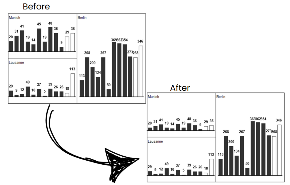
Imagine you're preparing a monthly sales dashboard comparing performance across six regions. Three are large markets with millions in sales, while others are smaller, newer territories. Without automatic scaling, Excel might stretch the axis of smaller-region charts, making their performance look negligible—even if they're growing rapidly.
With automatic chart scaling, all charts use a uniform axis range. This means:
You're minutes away from presenting your KPI report to executives. A new data file comes in with updated numbers. Normally, updating the data might throw off your carefully adjusted charts—scales change, bars shoot off the chart, or labels overlap.
With automatic chart scaling, the moment you refresh your data:
Your team is building a standardized reporting template for different departments. Each department has unique metrics and data ranges—Finance, HR, Marketing—but you want the same chart structure applied across all.
Automatic scaling ensures:
You have just signed for your free 14-day trial of XLBuddy! We're excited for you to discover how you can supercharge your spreadsheets and save hours of work.
We've just sent an email with your personal license key and simple installation instructions to the address you provided. It should arrive in your inbox within the next 5 minutes.
To ensure you get started smoothly, please keep the following in mind:
Check your Inbox: Look for an email from [email protected] with the XLBuddy in the subject line.
Look in your Spam folder: If you don't see the email in your primary inbox, please take a moment to check your spam, junk, or promotions folder. Sometimes, our trial request emails get mistakenly filtered.
One Trial per user: Please note that to ensure a fair trial for everyone, our system is set up to create only one trial license per email address. If your email has been registered for a trial in the last year, a new key will not be generated or sent. If you used other mail than previously, you will not be able to activate the second trial either.
Having trouble?
If your email hasn't arrived after 15 minutes and you're certain this is your first time signing up, please don't hesitate to contact our support team at [email protected]. We'll be happy to get you sorted out right away.