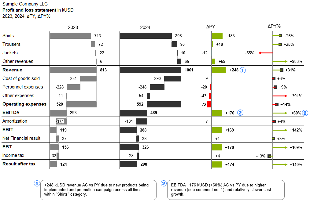
Finance professionals often need to explain differences between expected and actual results — but traditional tools require manual steps to build variance charts, often leading to errors or unclear messages. Our custom charts streamline this by offering built-in variance chart types that automatically calculate and visualize deviations, adhering to IBCS design principles.
You can instantly show positive and negative variances, and highlight critical drivers — all within a visually clean, standardized layout. This not only reduces time spent building visuals, but ensures decision-makers get the right insights, faster. Whether for a monthly PnL review or a year-end budget analysis, our custom charts bring clarity to complex comparisons.
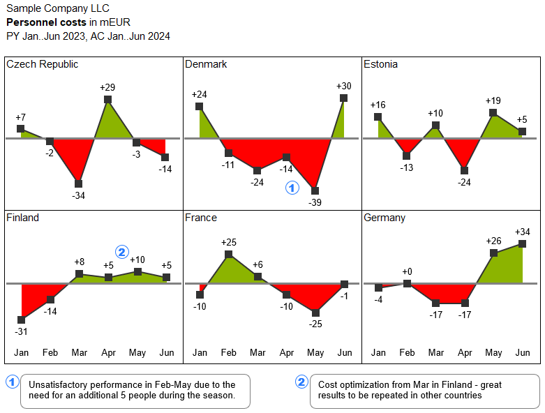
Sales and marketing teams managing multiple regions often face the challenge of creating dashboards that are both flexible and standardized. One country may need a double column chart with product-level detail, while another prefers a waterfall breakdown by channel. Manually adjusting layouts in standard tools creates inconsistencies and delays.
With our custom charts, users can select the most appropriate chart type for each situation, modify labels, add highlights, and still ensure visual consistency across the report. Built-in formats and intelligent defaults reduce friction while supporting localized storytelling. The result is a flexible reporting system that adapts to market needs without compromising corporate standards or your own, industry specific needs.
Executives need reports that are high-level but insightful, often requiring custom chart configurations to match how they interpret trends and performance. Unfortunately, standard tools either over-simplify visuals, require complex workarounds to tailor charts for strategic audiences.
XLBuddy bridges this gap by giving users the ability to fine-tune almost every aspect of the visualization — from element widths and axis scales to specific scenario details. Analysts can create focused, high-impact visuals that tell a clear story without overwhelming the viewer. This ensures executive summaries are both sharp and informative, supporting quicker, more confident decisions.
You have just signed for your free 14-day trial of XLBuddy! We're excited for you to discover how you can supercharge your spreadsheets and save hours of work.
We've just sent an email with your personal license key and simple installation instructions to the address you provided. It should arrive in your inbox within the next 5 minutes.
To ensure you get started smoothly, please keep the following in mind:
Check your Inbox: Look for an email from [email protected] with the XLBuddy in the subject line.
Look in your Spam folder: If you don't see the email in your primary inbox, please take a moment to check your spam, junk, or promotions folder. Sometimes, our trial request emails get mistakenly filtered.
One Trial per user: Please note that to ensure a fair trial for everyone, our system is set up to create only one trial license per email address. If your email has been registered for a trial in the last year, a new key will not be generated or sent. If you used other mail than previously, you will not be able to activate the second trial either.
Having trouble?
If your email hasn't arrived after 15 minutes and you're certain this is your first time signing up, please don't hesitate to contact our support team at [email protected]. We'll be happy to get you sorted out right away.