Congratulations on getting set up! In this module, we’ll dive into the fun part: creating a professional-looking chart in seconds. You’ll see just how fast you can turn raw data into a powerful visual story using XLBuddy.
Before we can create a chart, we need some data.
| Office location | Region | Sales |
| New York | Americas | 120 |
| Los Angeles | Americas | 95 |
| Toronto | Americas | 80 |
| Americas | 295 | |
| London | Europe | 110 |
| Paris | Europe | 85 |
| Berlin | Europe | 92 |
| Europe | 287 | |
| Tokyo | APAC | 130 |
| Sydney | APAC | 75 |
| APAC | 205 | |
| World | 787 |
Now, let’s use the XLBuddy to create our vertical waterfall chart. It will guide you step by step.
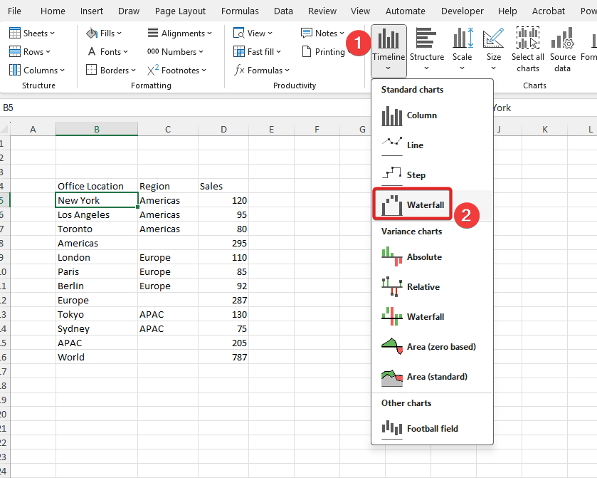
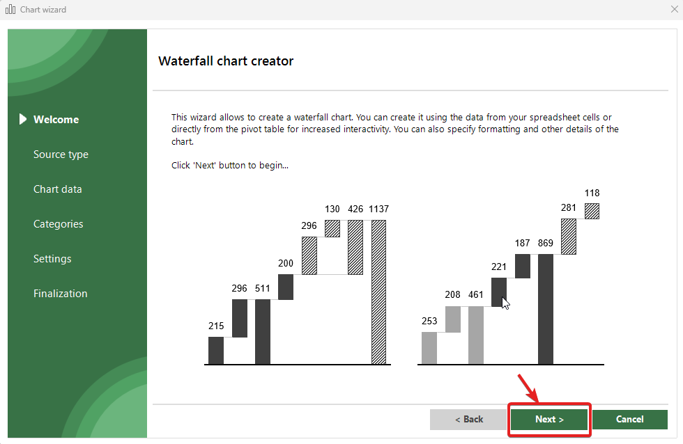
Once the wizard appears, click next:
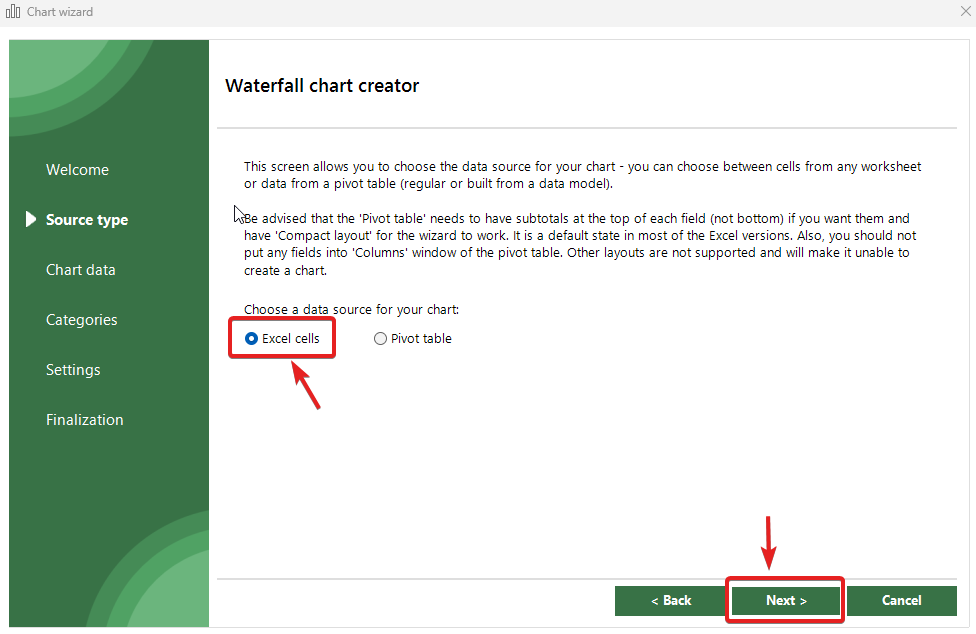
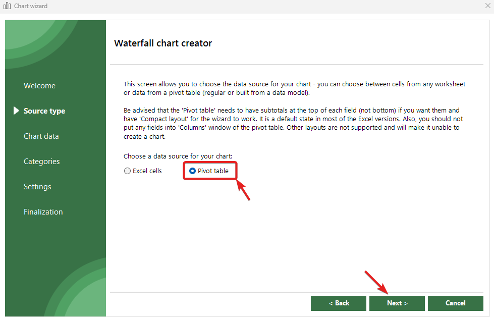
On this screen you can choose if you want to create your chart using Excel cells (pointing directly to specific ranges) or by using an existing pivot table. We will present two ways in the following sub sections.
In this step, we will use “Excel cells” as the source of data for our chart:
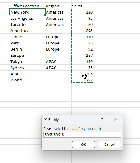
Now, we need to select the ranges with data for our chart. Click on the green “+” button and select the sales data:

As you can see, this screen allows to select up to four, non-adjacent ranges for your chart. It means that you can gather your data points from different places within the same workbook and plot all of them, one by one on the same chart! To do it, simply select the checkboxes for additional fields, select your data and you are good to go:
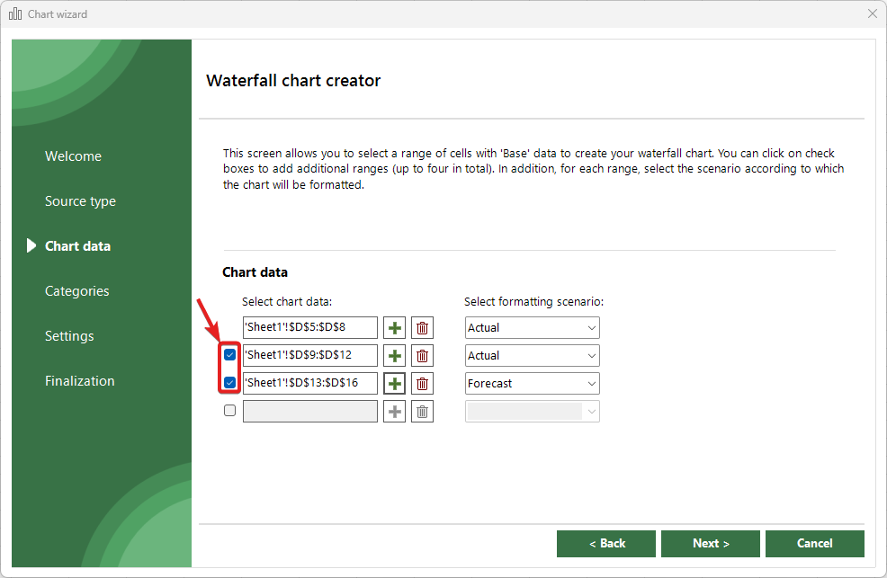
This unique features allows you to combine data from different places, very useful in for example, financial modelling world. You don’t need to modify your data, just visualize it!
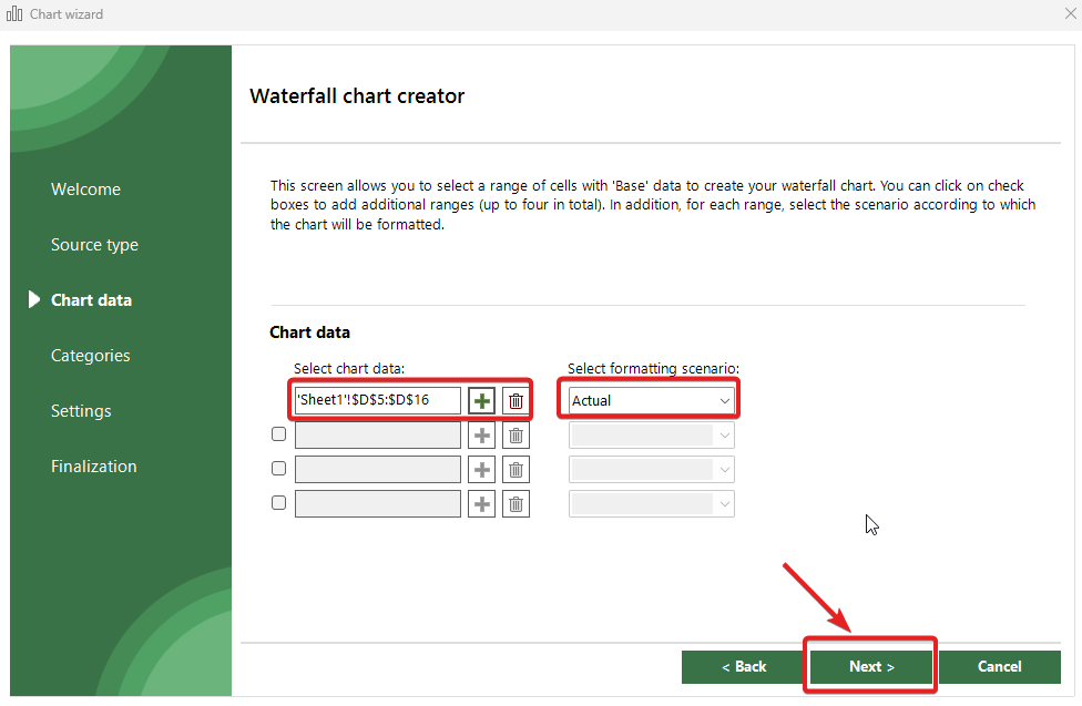
Once you select your data, you need to select the formatting scenario that you will apply to your chart. By default, XLBuddy provides four scenarios:
By default, scenarios format the chart based on IBCS principles. You will learn more about Styles and Scenarios in Module 4 of this Getting started guide.
In addition, if you select multiple ranges then you can use them to plot multiple scenarios on the same chart right away, like Actuals and Forecast. But, for our current case, we will choose “Actual” and click “Next“
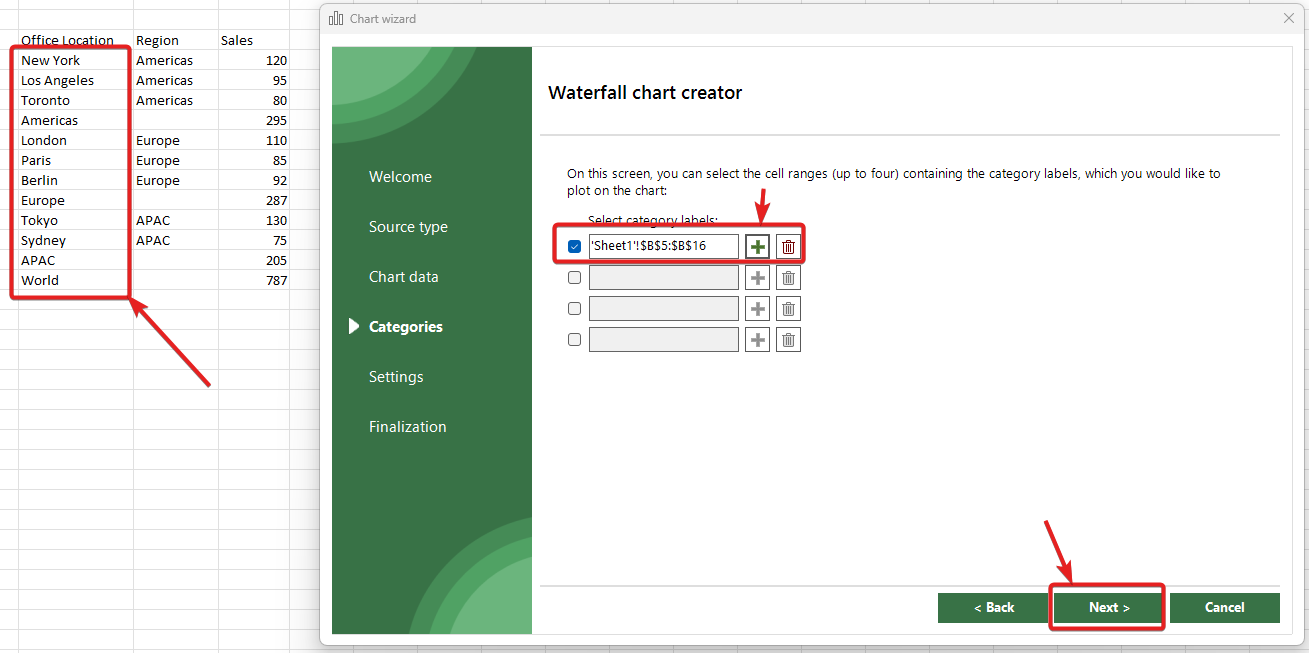
The next screen allows to select data range with our category labels. In our case, this will be our Office Locations. As previously with our numerical data, please click on the green “+“, select the correct range and click “Next“:
We will be presented with some settings that we can tweak if the chart type allows for such modifications, but right now, we will leave it as it is and click “Next“. To proceed, please move to the Step 3 below.
In this step, we will use “Pivot table” as the source of data for our chart. Charts created from pivot table are fully dynamic, refresh with pivot table refresh and plot all data automatically. They might be very useful in certain cases, but also limiting if you need to plot something extremely specific. It is up to you to decide if they will be a good fit for you or not.
Beware, that they are more resource intensive than “traditional” charts, therefore creating 30 of them will make Excel slower than with the 30 standard charts.
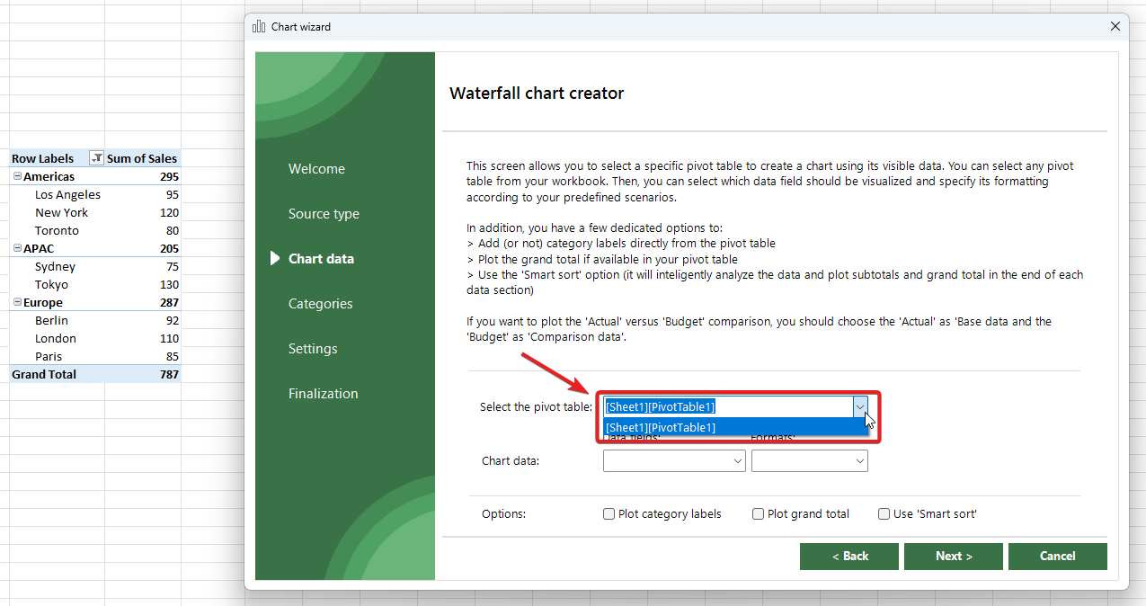
Now, we need to select the specific pivot table, which we want to use as our chart source. Click on the box and select the specific pivot table:
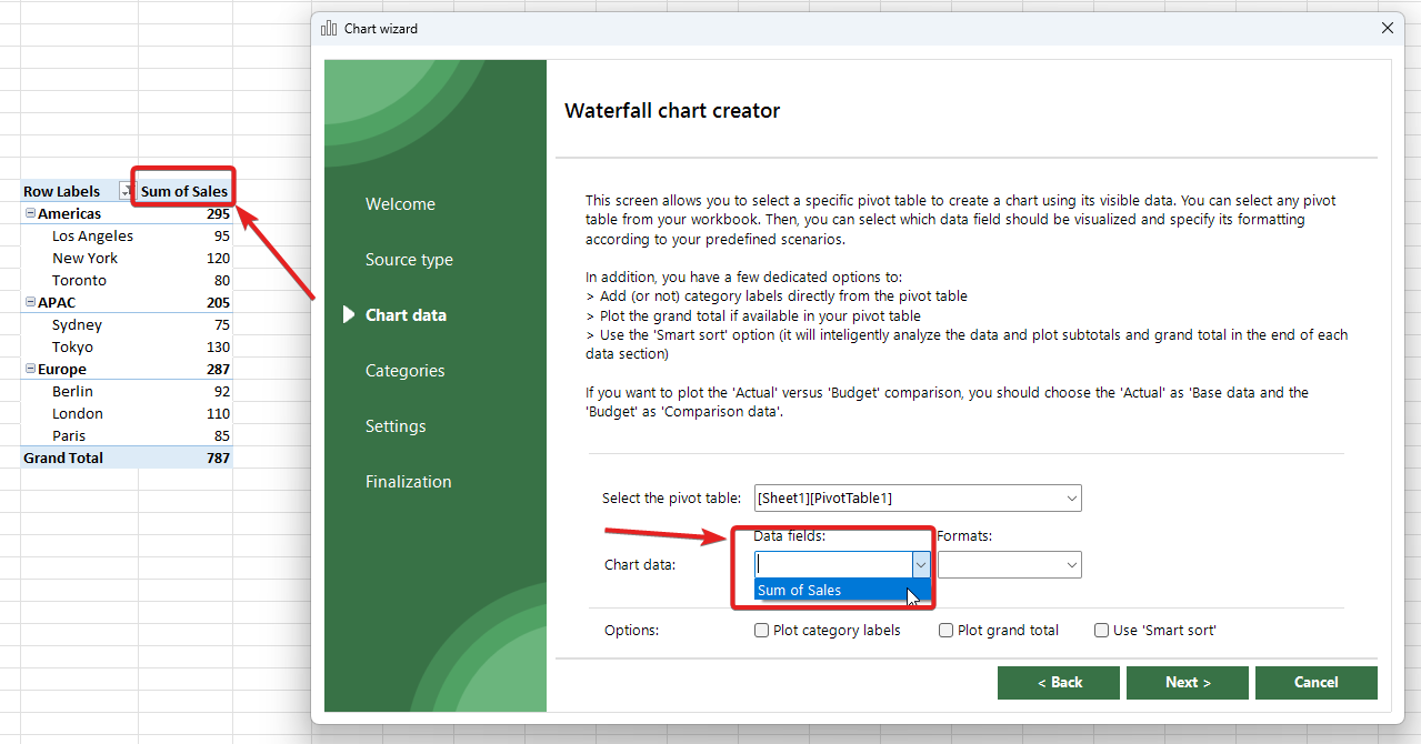
Once the pivot table is selected, you need to select a data field, which you want to plot. In our case, it is going to be “Sum of Sales“:
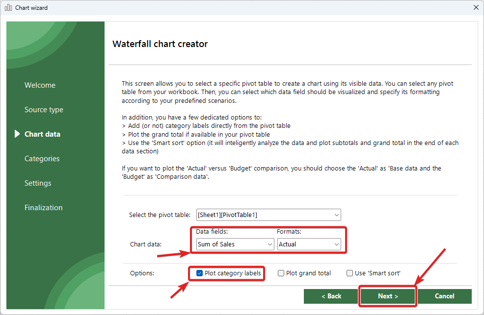
Once done, you need to select the formatting scenario that you will apply to your chart. By default, XLBuddy provides four scenarios:
By default, scenarios format the chart based on IBCS principles. You will learn more about Styles and Scenarios in Module 4 of this Getting started guide.
In addition, you can select one of the checkboxes below to:
We will choose “Actual” for now and “Plot category labels“, and click “Next“:
On the next screen, we will be presented with some settings that we can tweak if the chart type allows for such modifications, but right now, we will leave it as it is and click “Next“. To proceed, please move to the Step 3 below.
For more info about charts created from pivot tables, check the dedicated documentation section.
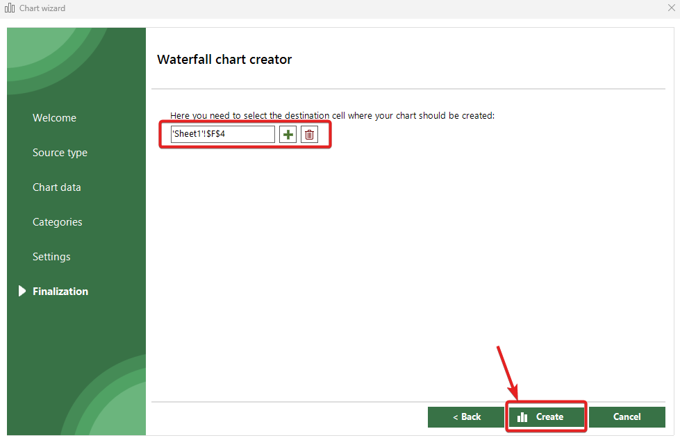
On the final screen, we need to select a destination cell, where we would like to create our chart. When ready, click “Create” button to create your waterfall chart:
And our chart will appear where we wanted it to:
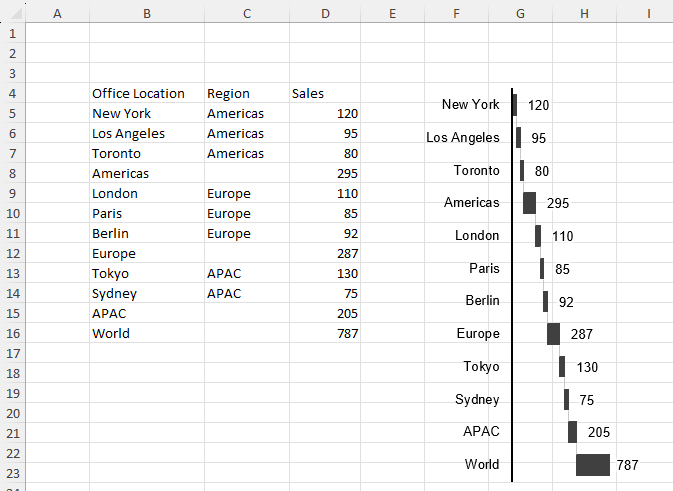
Voilà! Your new vertical waterfall chart instantly appears on your worksheet. You’ve just turned a table into a visual in a fraction of the time it normally takes to create such chart in Excel.
You’ve successfully created your first chart! You can see how the process is streamlined to get you from data to decision-making faster. This workflow is the same for all our chart wizards.
In Module 3, we’ll explore how to customize the look and feel of your charts, including colors, labels, and appearance of specific bars.
You have just finished reading on how to create your first custom chart using XLBuddy. Charts are built using Excel’s built-in functionality, taken to the “extreme”. Data used to create chart is stored within the workbook where the chart is located ((it is NOT transfered anywhere), making the chart “bound” to that particular workbook. You cannot move the chart to another workbook without “breaking” it.
We hope you found what you were looking for! If your question wasn't answered here, or if you need more personalized assistance, please feel free to contact our friendly support team here.