Great work on creating your first chart! In this module, you’ll learn how to modify your charts to perfectly fit your reports and presentations. A well-made chart tells a story and we will show you how to convery it with clever formatting tools that we provide to you.
All formatting and editing options are available once you select your chart. You can access the specific features by using:
All three methods lead to the same features, so you should use whatever method you find most convenient for your style of work with Excel.
Now, let’s dive right into the most frequently used editing options. We will briefly discuss them below to give you an idea how to work with XLBuddy’s visuals. We are sure you will figure out the rest!
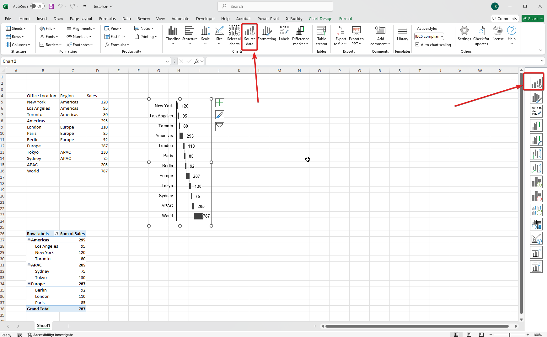
Data is rarely static. We are sure you will build your charts with data refreshes in mind but sometimes, you cannot foresee everything. Let’s say your original chart has all regions of data and you need to remove APAC from it. Updating your chart with XLBuddy is simple.
To do it you need to select your chart and then click on “Change source” button:
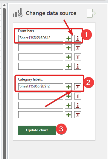
You will be presented with the dedicated task pane, which you can use to modify the chart’s source range, in exactly the same way you have done during chart creation.
For chart created from cells, simply click on the red “Trash bin” button to remove a range and on green “+” button to add/modify it. Once done, click “Update chart” button:
As you can see on the image below, our chart instantly updated itself to the new range (without APAC region), keeping the existing formatting:
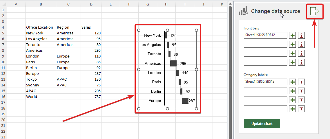
To close the task pane, click the button highlighted on the image above or de-select your chart – it will then close automatically.
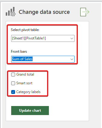
For the chart created from pivot table, you can select a different field for your chart or even a differnt pivot table if you need to. You can also tweak various settings, just like in the chart creator but without the need to re-create the chart from scratch:
Editing your chart can mean two different things:
In this section we will cover both scenarios to introduce you to the general concept how the chart editing works in XLBuddy.
To access the formatting task pane, click the “Formatting” button:

Before we dive into the specific features, we need you to understand the fundamental concept of editing a chart. It is done by first selecting what you want to edit using the task pane combobox:
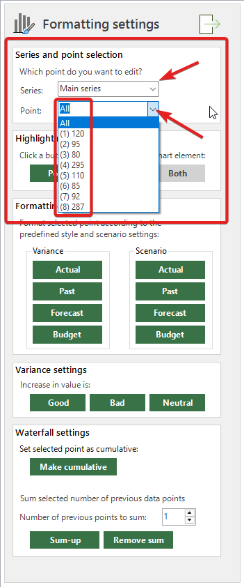
You can choose to edit either “All” points (so the whole chart) or a specific, single point. You can of course edit them by one by one.
We designed XLBuddy this way to give you the full and absolute control on how you want to style your charts. We know how important it is in real-world applications (especially if you follow a rigorous standard, like IBCS) to be able to do that. While it may be tedious at times, the total and absolute control with all its benefits greatly outweighs the drawbacks many times over.
To edit a specific point you need to do two things:
You can select a specific point from the list. Each point has its own ID number and the label, for easier selection. After selection, you can make your modifications.
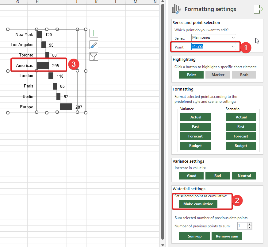
Various charts, just like the vertical waterfall (our case) allows to make edits to their structure. Our waterfall chart can be modified by making specific points cumulative (sum of all precedent points) or act as a sub-total of X previous points.
In our case, we might want to make “Americas” region total of all previous bars. To do that, let’s select the point and click “Make cumulative” button. As you can see below, the data point will become a cumulative bar:
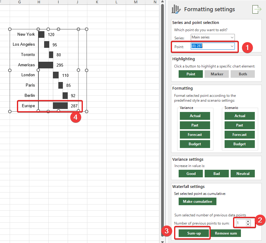
For “Europe” region, we want to make it a sub-total of all european locations, so we want to sum three previous bars, London, Paris and Berlin.
To do that, select point “Europe”, select that we want to sum previous three points and click “Sum-up” button:
It was easy and straightforward edit. Now imagine how much time would you have to spend on creating all formulas and manipulating the chart to achieve what we have done in a few seconds!
The above edits are just example. Various charts might offer different options – all of them will be accessible from the “Formatting” task pane.
You can also easily change formatting of your charts. Imagine a case where some data gets modified and you want to change the color or pattern of specific bar. Or, a case where you want to quickly change formatting of the whole chart to different style according to the IBCS notation, any other standard or your internal rules (or that one specific person “taste”!).
It can be done in Excel, quite easily, but you would need to remember exactly how to format it, what colors to use, what shade, what line style, what pattern etc. and then, apply all of that manually… We could imagine better ways to spend your time in work.
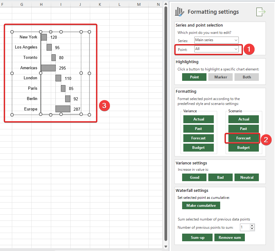
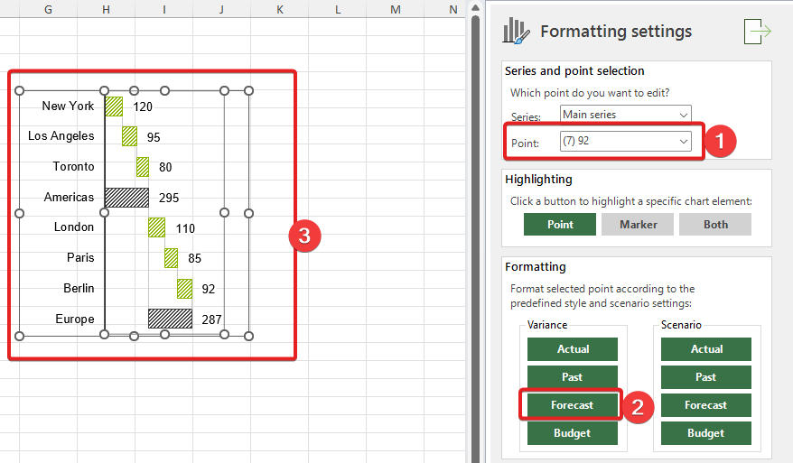
Fortunately, you can easily modify the formatting of your charts using XLBuddy by just selecting a point (or all of them) and clicking the specific scenario button. Let’s say we would like to change formatting of our waterfall chart to “Forecast” according to IBCS. Just activate the chart, keep the “All” points selected and click “Forecast” button. Your chart will be formatted immediately:
Now, let’s say we would like to keep the formatting as “Forecast”, but we would like to format all specific cities according to variance variant of “Forecast” scenario. To do that we would select specific points and then click “Forecast” button under the “Variance” section:
Pretty great right? This particular formatting option is available for waterfall charts, but various chart types might have various other options available.
Imagine how much time (and your memory!) would it take to remember all potential formatting combinations to just stay consistent. And then imagine editing all points manually using built-in Excel tools… So much time wasted! With XLBuddy you can set your predefined styles and scenarios within them and then just quickly change formatting of any chart created using the add-in.
Formatting task pane also allows to do other things like changing the color of “variance treatment”, for example if increase in value is favorable or unfavorable (good or bad). The flow is the same – select a point, click button and you are done. For example, we can change all increases to bad/unfavorable:
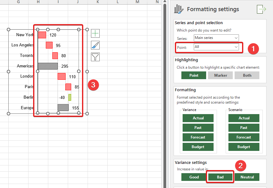
These colors are dynamic, so if you data changes to negative (as on the image above) the right color is shown.
Section 2.3 described how to format your chart based on a single chart selected. XLBuddy allows to format charts in bulk. Imagine a case where you have multiple charts, one for each region. In total you have X charts and once the updated data comes in, you would like to change the formatting of each chart from “Forecast” to “Actual” for one of the data points – after all you have a real data ready and your charts need to reflect that updated data.
To do that, just select all charts, which you want to format and click “Formatting” button. You will be presented with a simplified formatting task pane. Select which point you want to edit (for all charts) and click the specific scenario button to format all your selected charts.
Before:
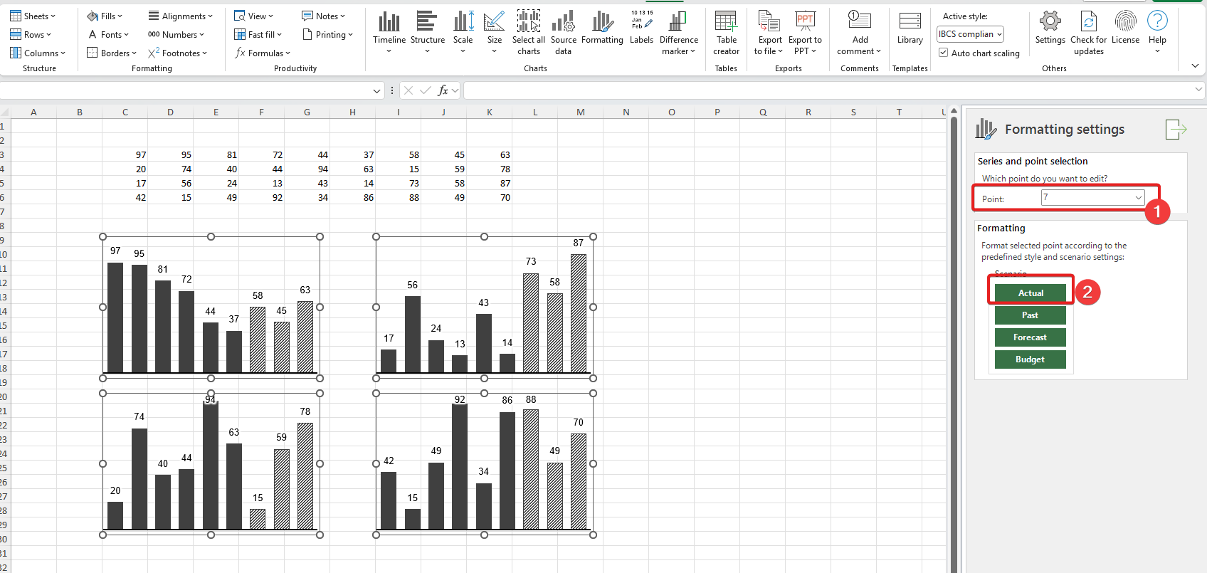
After:

This feature works for multiple charts, even if they are of a different type. It means that you can select column, waterfall and variance charts at the same time and format specific point as “Actual” for example. It can greatly speed up time needed to prepare your report or presentation.
Another very useful option (common for all charts) is the “highlighting”. It allows you to highlight a specific point making it a specific color. For example, let’s say we agree internally within our company that we want to highlight important elements on reports with light, strong blue color. We can set it up in XLBuddy’s settings and use it, just like we used the formatting options.
To highlight a bar, select a specific point and in highlight section click “Point”. The selected bar (“Europe” in our case) will be immediately highlighted with the predefined color:
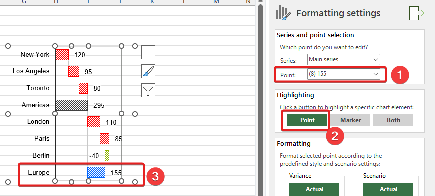
This can be very useful to make quick highlight after for example, data refresh. New data comes in and we highlight key elements so our report recipients can quickly identify the key areas of interest.
The three buttons:
are there to allow you to select various chart elements, for example in line charts you can highlight a line, marker or both of them, depending on your specific need.
A chart without clear labels is like a map without city names – it shows the landscape but doesn’t tell you where you are. The labels on your chart give context and precision to your data, transforming a simple visual into a powerful communication tool. Customizing your data labels (the values on each bar or point) and category labels (the names for those bars or points) is essential for ensuring your message is understood instantly and accurately.
To edit chart labels, you need to select the chart first and then click the Edit labels button:
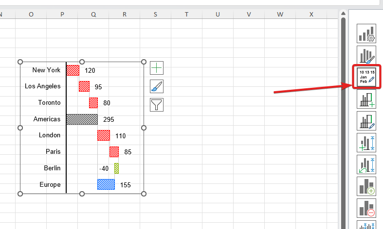
You will be presented with a dedicated task pane. As with other modifications, you first need to select which series and which point you want to edit and then you can proceed to all available options:
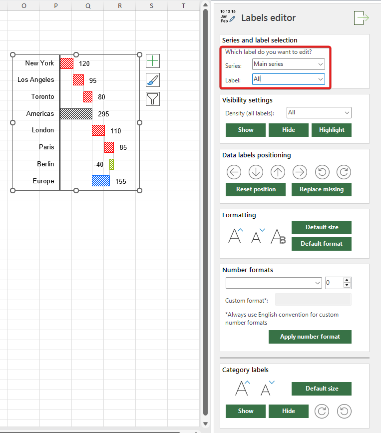
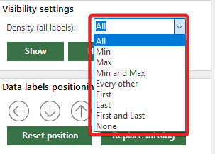
In this section you can change if specific label should be visible or not. For example you might want to hide the back columns labels. You can either select a specific point and ‘Show’ or ‘Hide’ the label, or set a general ‘Density’ feature.
This ‘Density’ feature will act as a setting for the whole selected series and it allows you to set dynamic visibility of your labels, for example – you can show only MIN and MAX data labels, or only LAST label. There are various options available:
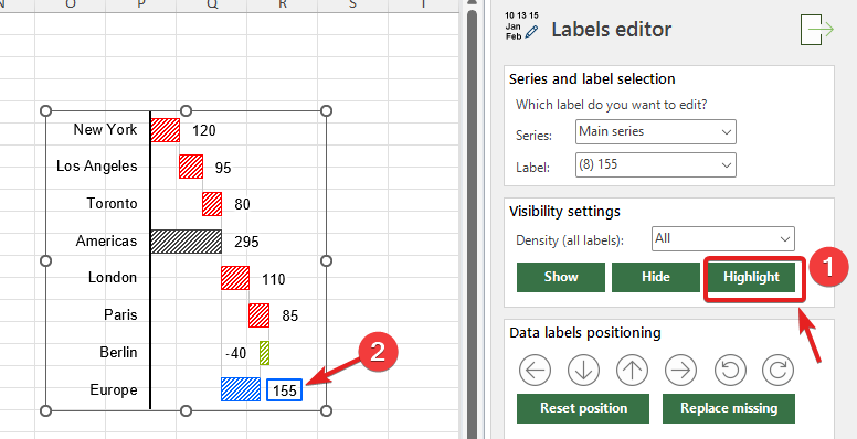
In addition, you have a ‘Highlight’ option, which let’s you highlight a specific data label to draw attention to it:
These two sections allow to change the position of specific label (or all of them). In addition, you can reset position to the default, replace missing label (in case you accidently delete it).
It also allows you to modify the size and appearance of the label. You can increase/decrease the font size, control it’s bold state, and reset formatting or size to the default state.
This section let’s you change the number format of your data labels. You can choose from the list of the most commonly used, default formats:

Or set a custom one, to whatever you might like. In addition, you can add or remove decimal places from your data labels
Please note that setting a custom number format allows to use Excel’s custom number format technique, but you must use English style convention. Custom number formats in Excel differ depending on the localization, for example, American users have different separator signs or use different methods to set thousand separator. If you want to use the custom number format, you need to follow the default, ‘English’ convention. Otherwise it might show wrong, undesired format.
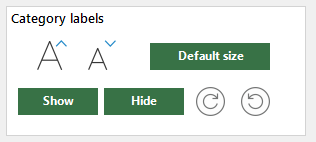
This section allows you to modify the basic appearance of category labels. These settings apply to ALL category labels, not specific labels:
Excellent! You’ve now mastered the essentials of chart modifications with XLBuddy! By applying these principles, you can ensure your work is consistent and professional. As you can see, XLBuddy allows you to not only create a comprehensive chart quickly, but to also format it in seconds. It is very handy not only when you design your reports from scratch, but also when you need to make quick edits before the important meeting as the recent data comes in.
Our next article (Module 4) will dive into XLBuddy’s settings, where you’ll learn how to create and save your own unique styles, scenarios and specific settings, so you can easily and quickly apply them to your visuals and reports.
We hope you found what you were looking for! If your question wasn't answered here, or if you need more personalized assistance, please feel free to contact our friendly support team here.