In this module, we will explore the “Difference Marker,” a powerful tool for visualizing variances in your data. Using this feature correctly will make your charts clearer, more insightful, and compliant with professional reporting standards.
A Difference marker is a visual element used to clearly show the difference between two data points on a chart. Based on IBCS principles, its purpose is to make variances – such as the gap between “Actual” and “Plan” or “Current Year” and “Previous Year” – immediately obvious without requiring the viewer to mentally measure the distance.
Instead of just showing two bars or points, the ‘Difference Marke’r explicitly draws the gap between them. This instantly tells the story of performance: are we above or below target, and by how much?
XLBuddy allows you to add multiple ‘Difference markers’ on the same chart, depending on your specific needs. It may be useful if you want to compare different periods or categories of data without creating a dedicated visual.
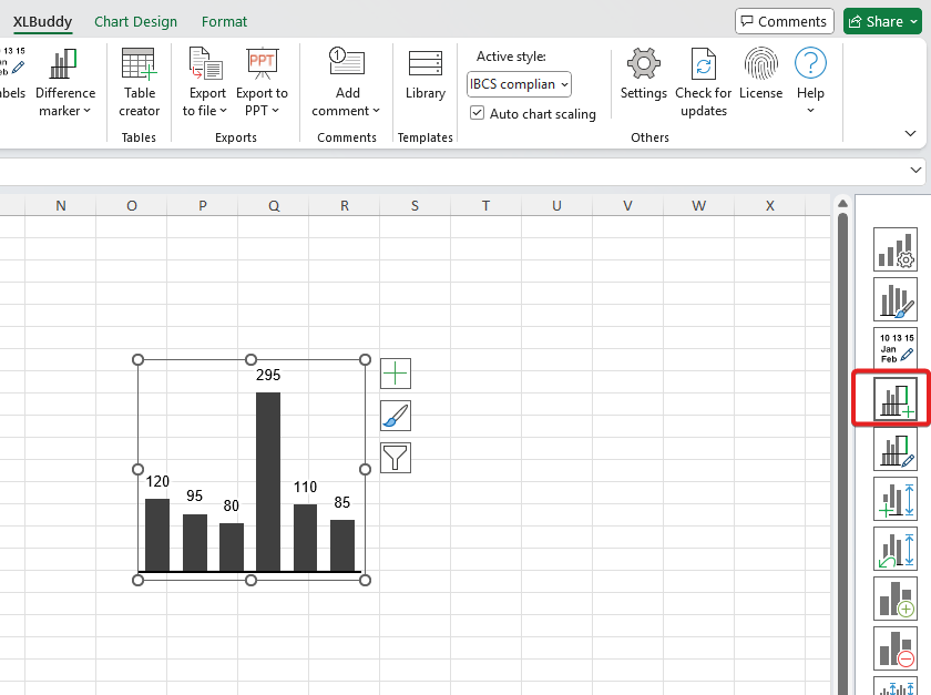
Adding a ‘Difference marker’ is a straightforward process, but it requires a chart that is set up for comparison. Once you have it, select it and click the ‘Difference marker’ button:
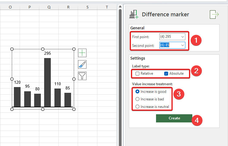
The task pane will appear. There you need to select two points, which we will compare.
If you want to compare how June results were versus April, April will be “First point” and June “Second point”. Once you select the specific points to compare, choose what kind of variance do you want (relative or absolute) and select variance color treatment (if increase in value is good/favorable or bad/unfavorable, or perhaps neutral). When all is set, click “Create” button:
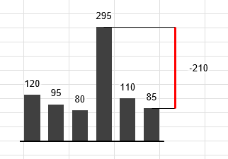
As you can see, the ‘Difference marker’ immediately provides an information about our performance, how we did, was it good/bad and by how much:
To edit a ‘Difference marker’, simply select a chart with it and click edit button:
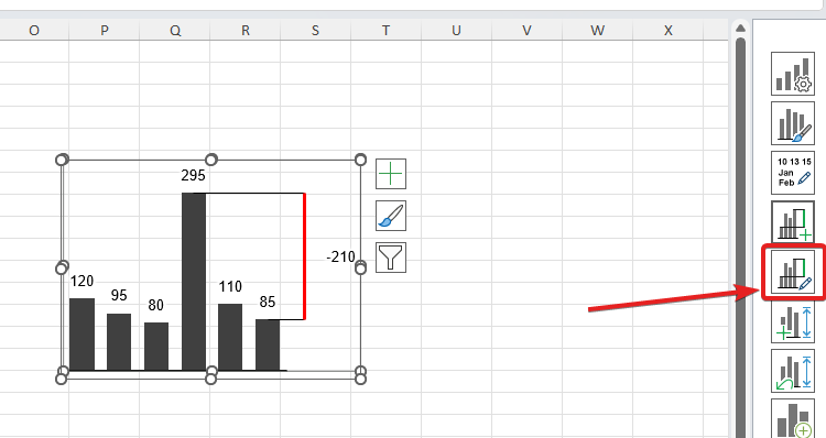
The dedicated task pane allows you to modify various settings. To proceed, you need to select the specific ‘Difference marker’ that you want to edit and then, all available option will enable themselves:
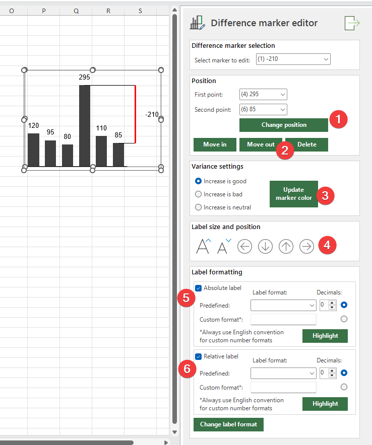
The task pane allows you to:
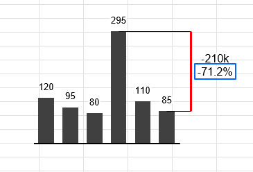
By tweaking these settings, you can modify the original, very simple ‘Difference marker’ to something like this:
We hope that you now have a clear understanding of ‘Difference markers’ and feel confident using them to make the variances in your data instantly clear. Getting a good grasp on this tool is a key step toward creating highly professional and insightful reports.
In the upcoming Module 6, we will tackle the critical concept of scaling. We’ll explore the options in XLBuddy that ensure the reports and data you present accurately reflect the truth. Proper scaling prevents visual distortions that can lead to misinterpretation, helping you tell the true story with your charts.
We hope you found what you were looking for! If your question wasn't answered here, or if you need more personalized assistance, please feel free to contact our friendly support team here.