Have you ever looked into a funhouse mirror? Your reflection becomes distorted – wildly tall, short, or wide – giving you a misleading picture of reality. The same thing can happen with your charts. The scale you choose for your axes is like the mirror of your data; it can either reflect the truth accurately or create a distorted, misleading impression.
Proper scaling is one of the most important aspects of honest data visualization. It ensures that the visual relationships in your chart match the numerical relationships in your data. In this section, we’ll explore how XLBuddy can help you with setting a proper scale for your Excel charts.
If you ever created a report in Excel, you know very well how frustrating it can be to try to scale your charts. In XLBuddy we have implemented multiple ways to scale your charts properly and therefore, show your data without misleading impressions.
We offer multiple scaling methods (including automatic ones) but before we dive into specific features, we want you to understand how the scaling works.
Our scaling is based on dedicated algorithms, which measure the chart size, column/bar sized etc. to correctly determine the scaling. All features, the manual and automatic ones, fix the scale for a specific ‘moment’. It is a drawback in Excel that we need to accept if we want to have a ‘pixel perfect’ (or close to it) solution.
It means that while our charts work on end-users computers, even without the XLBuddy license, the scaling will not. You should remember to remove the modified scales (reset them, we will show how to do it later in the article) before sharing your report with other people who might not have the XLBuddy license on their computer).
In this section, we will discuss all scaling methods available in XLBuddy add-in. The choice which to choose and when is up to you.
The most basic option is setting a manual scale. To do it, select your chart and click the ‘manual scale’ button. New window will appear where you can type what scale would you like to set for your chart (or multiple charts). Once filled, click ‘Update scale’ button to see the results.
Before:
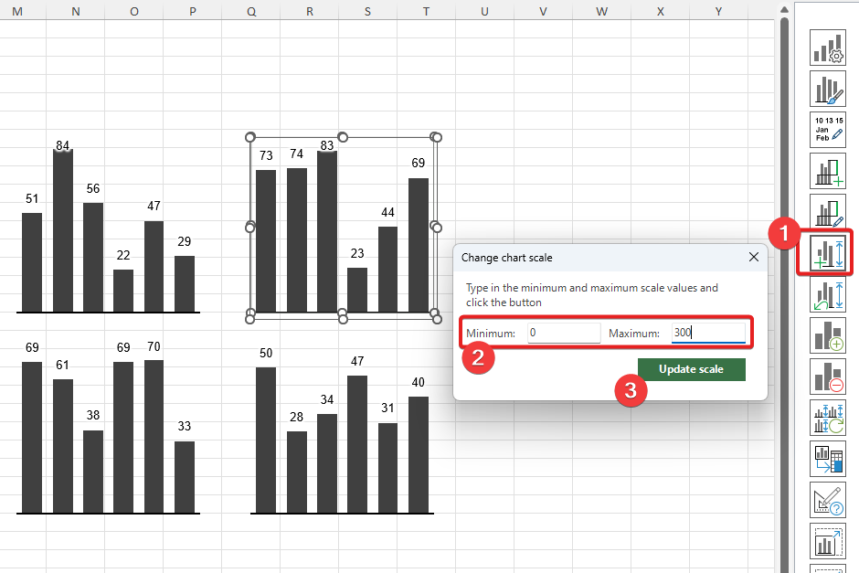
After:

Manual scale is fixed and it stays for as long as you keep it. It will not update with new data coming into the chart. You can reset it according to the point 3.2 instructions from this article.
To reset your scale to Excel’s default behavior, please select the chart, which you want to reset scale for and click ‘reset scale’ button. After a blink of an eye, the custom scaling will be removed.
Before:
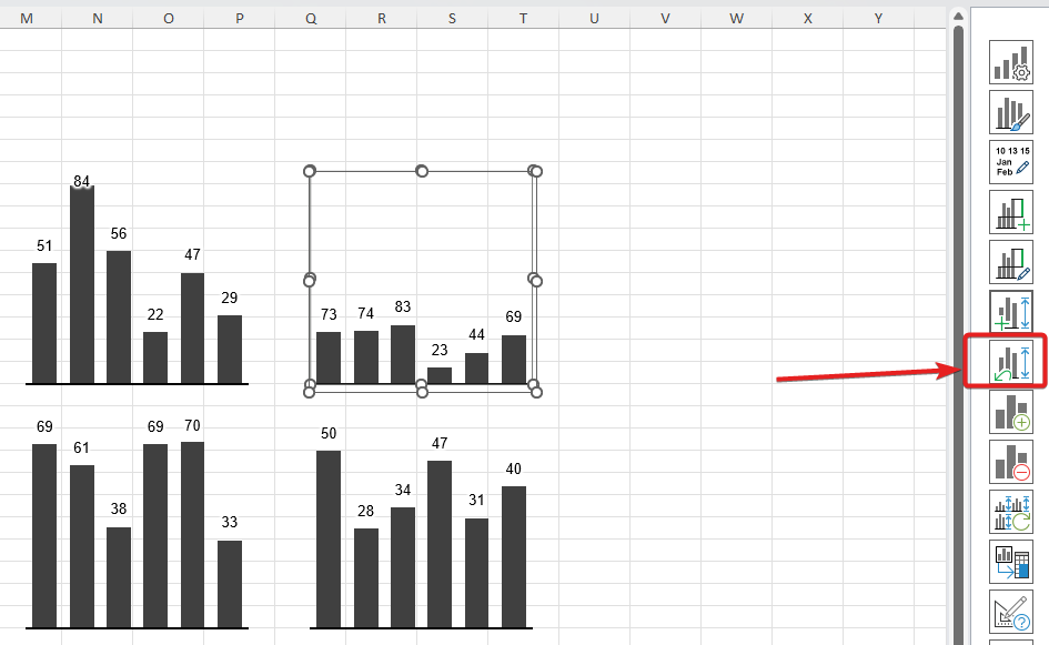
After:
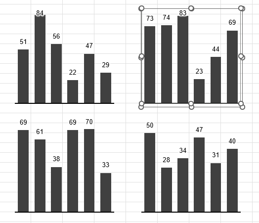
XLBuddy offers an option to unify scales between charts. This feature works only for multiple charts. It will use our algorithm to measure everything and unify scales accross all selected charts, taking into account their size, data etc.
To do it, simply select all charts, which you want to unify and click ‘unify scales’ button.
Before:
After:
As you can see, all scales have been unified and despite charts having different sizes, the scale is correct.
Please note that this method is ‘manual’ – it locks the scales until another manual unification or reset.
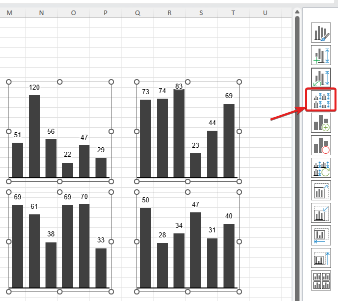
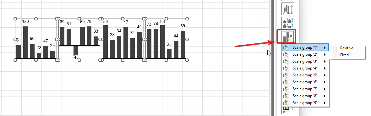
Automatic scaling in XLBuddy is a unique feature that allows to unify scales accross different ‘scaling groups’ similarly to ‘3.3 Manual scale unification’, but it does it automatically.
You can assign your charts to specific groupsand then these groups will be scaled within their own, meaning all charts from group1 will be scaled against each other and charts from group2 will behave the same. It allows you to have two or more different scaling on the same worksheet or workbook and keep everything ‘correct’.
To add charts to the specific scaling group, select them and click on the ‘add scaling group’ button and select a specific group with scaling mode. There are two scaling modes (described in 3.4.1) and up to 9 groups, which you can use:
To remove charts from the scaling group, select them first and then click ‘remove scaling group’ button:
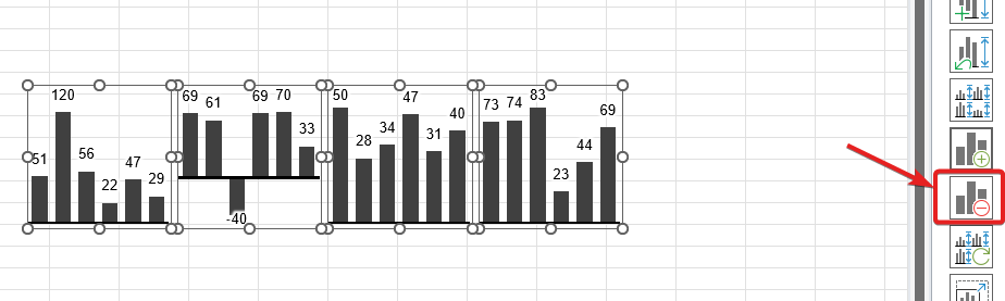
The scale group will be removed instantly.
XLBuddy offers two scaling modes:
‘Relative‘ mode will behave exactly like ‘manual unification’ but in an automated way. It will measure the charts and it will scale them properly irrespectively of their minimum and maximum values.
‘Fixed‘ mode on the other hand, takes not only the sizes of charts and data, but also minimum and maximum values. It is designed for small multiples, charts with the same size but different values, to make sure that no matter if the values are positive or negative, the scale is correct and the axis is in the same line inbetween them.
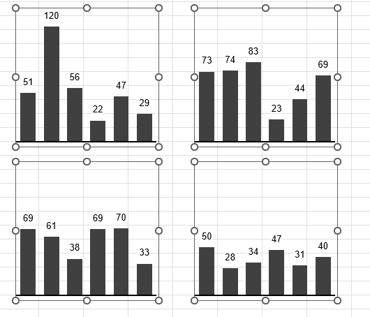
Let’s have a look at our example charts below. As you can see, one of them have negative data point, which makes the chart not properly aligned with other charts of the same size:
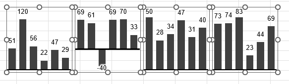
If we add these charts to the scaling group 1 with ‘relative’ mode, the scaling result will be this:
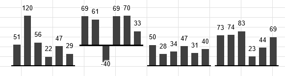
The scale is perfect, but even though the charts are the same in size (the outer size) they are still missaligned against each other.
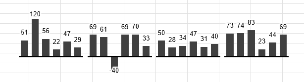
On the other hand if we choose the ‘fixed’ mode for autoscaling, the result will be not only the perfect scale for all charts, but they will also be aligned correctly:
We recommend that you choose ‘Relative’ scaling mode for charts that are ‘loosely’ placed within report (so it covers most of the use cases) and ‘Fixed’ only for your small multiples types of reports/dashboards (with many, even up to 20-30, identically sized charts on the same screen).
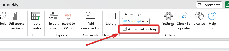
To turn on/off the auto scaling, you can use the checkbox on the ribbon:
We have heavily optimized our auto scaling procedure so it does not degrade your computer performance too much. Still, as you can imagine, in cases where you have multiple scaling groups and 30/40/100 charts, the performance might suffer.
In such cases, we recommend to turn off the auto scaling using ribbon’s checkbox for report development time and turn it on later when playing with the data.
Ultimately, scaling isn’t just a technical setting; it’s an ethical choice. The scale you select fundamentally determines the story your chart tells. We believe that by creating a report or dashboard, you commit to presenting your information with clarity and integrity.
We hope that the methods described in this article will help you in your reporting. In the next module, Module 7, we will learn about custom comments that you can add to your data to complete the story that your visuals tell.
We hope you found what you were looking for! If your question wasn't answered here, or if you need more personalized assistance, please feel free to contact our friendly support team here.