For many, tables are just dense grids of numbers – a necessary, but often overwhelming way to present detailed data. A poorly designed table can feel like a wall of text, forcing your audience to hunt for insights and mentally calculate differences. This slows down comprehension and can lead to misinterpretation. What if your tables could communicate with the same instant clarity as your best charts?
Our ‘Table creator’ is designed to solve this very problem. It’s a great tool, which allows you to build professional, IBCS-compliant tables. This module will show you how to do it and what options are available.
To launch the ‘Table creator’ please click the dedicated button on the ribbon:
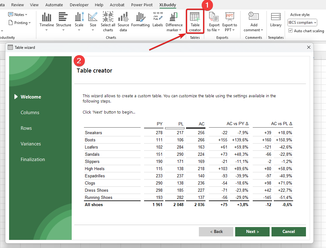
Using our creator, you can set various settings of your table.
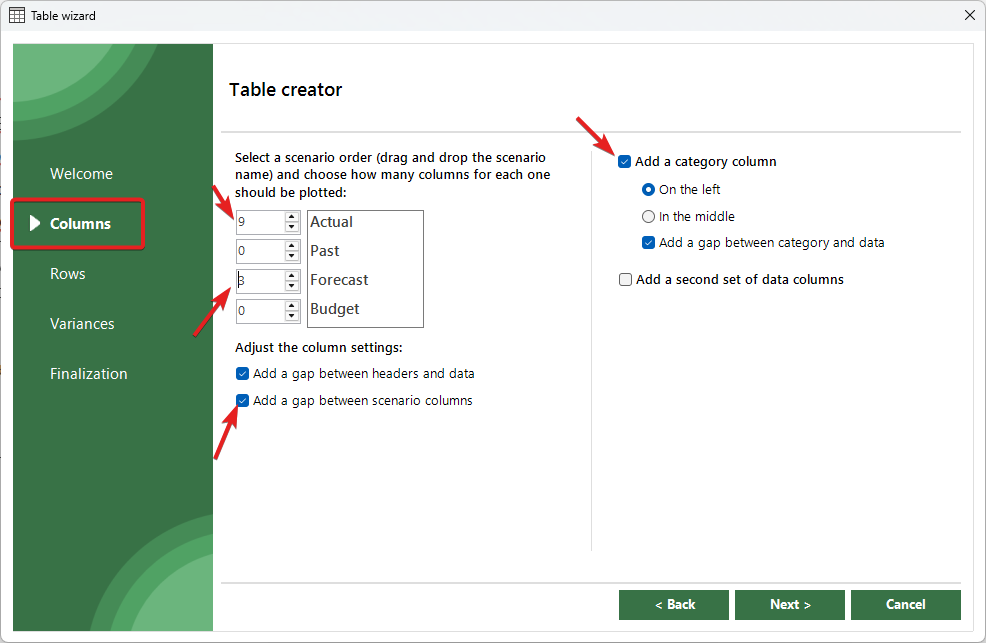
First, you specify various options related to the columns. You can create the table based on predefined scenarios (similarly like XLBuddy’s charts). You can set how many columns for each scenario you want and you can drag&drop the specific scenarios to reorder them in the table, which you will create (top scenario will become the left most one). In addition, you have other settings, which let you add gaps between specific columns, add category column (on the left or in the middle), as well as a second set of similar data (useful when you want to plot two data sets with category labels in the middle, between them).
On the screen below, we will create a table with category labels on the left, with some gaps, and 12 columns, 9 for actuals and 3 for forecast data:
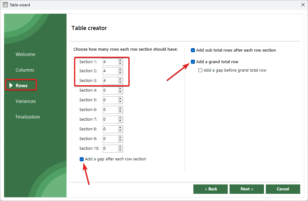
On the next screen, you can set the table settings related to the rows of your table. You can set up to 10 row sections in one table and you can decide if you want to add sub-total and grand-total. For our case, we will create 3 row sections with 4 rows each and add sub-totals as well as a grand-total:
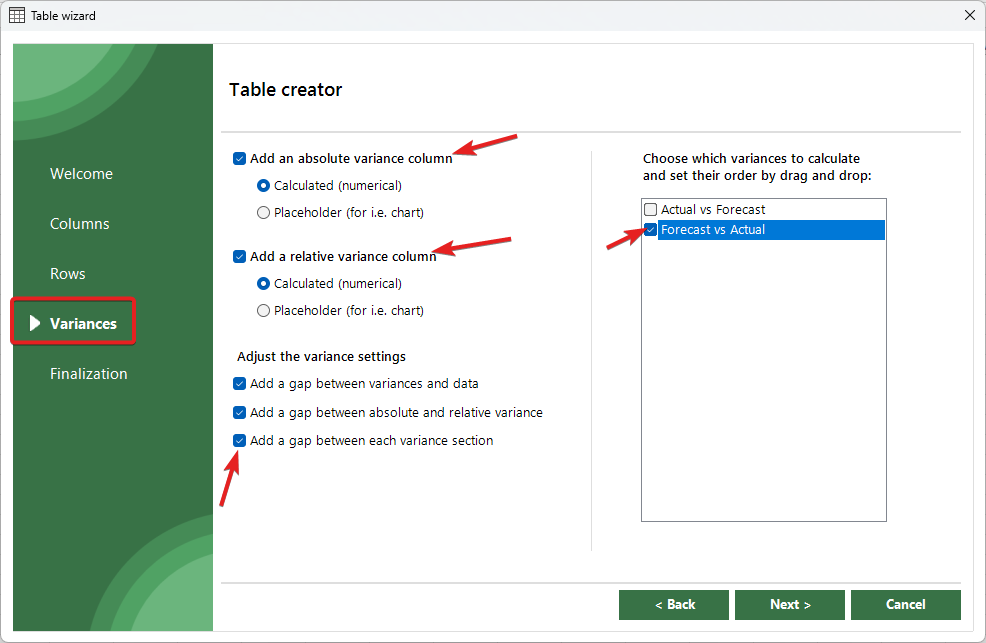
Next screen will allow you to add (or not) columns with variances for your data. The variances will be calculated automatically on last column from each scenario. This is default, fixed setting but once the table is created, you can easily modify it like in any ordinary Excel table. You can reorder variances just like the scenario names in columns, to plot them in a specific order in your table – simply drag and drop them higher or lower.
In our case, we will add a variance column, both absolute and relative with some gaps:
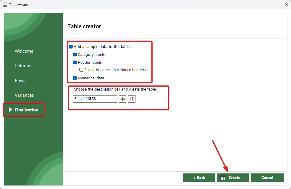
The final screen let’s you choose if you want to add a sample data to your chart and then, you have to select a left most cell where your table should be created (similarly to the chart creation process).
For variances, you can also specify if you want to create ‘Calculated’ variance, which will plot a column with some formulas, or ‘Placeholder’, which will plot much wider column that could act as a placeholder for your chart, which you can later create using our dedicated variance chart wizards.
Once done, click ‘create’ button to create your table:
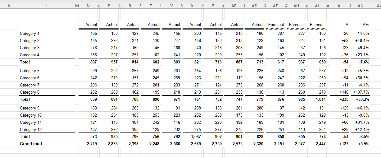
After a second or two, your table will be created in selected location:
By default, XLBuddy settings allow to create IBCS compliant tables. You can modify these settings to your specific needs.
In addition, once the table is created, the ‘Table creator’ does not close, keeping your settings. This allows you to create similar, or modified table again and again. This way you can very quickly create multiple tables or create a very comprehensive table-type report.
For example, if you forgot to add a few columns, or a different scenario, you can quickly go back in a wizard, change 1-2 settings and create a new table (or additional columns/rows, whatever is required).
You can modify many settings related to the ‘Table creator’ in the dedicated section of XLBuddy’s settings:
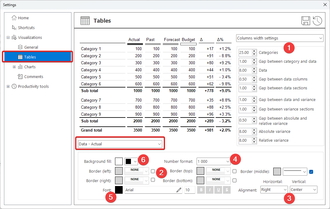
Here you can precisely define how each scenario should be formatted, in each specific table section. You can modify various settings such as:
And others. To edit a specific section appearance, first select this section from the list and then, make necessary edits. Most of the settings will have an instant effect on the visualized table, which will help you design precisely what you want.
The Table creator is designed to elevate your reports from simple data presentation to effective business communication. By embedding clear, consistent, and standardized design principles into your tables, you remove ambiguity and help your audience see the story behind the numbers in seconds. This isn’t just about making your reports look better; it’s about making them work better as clear and consistent tables lead to clear thinking, faster insights, and better-informed decisions.
In the next module, Module 9, we will see how we can store and then retrieve our carefully made reports or specific elements using XLBuddy’s Library feature.
We hope you found what you were looking for! If your question wasn't answered here, or if you need more personalized assistance, please feel free to contact our friendly support team here.